Well, the last three weeks have been quite an adventure. We’ve had breakdowns, accidents, injuries, life changes, work changes and exhaustion. For awhile there, I was on a simple loop of coping and sleeping. Things seem to be getting to a state of equilibrium now, in my new normal. I’ve been wanting to show you what I’ve been up to, and I’m so thankful I have the time and space to do that again.
First up, my workshop trunk. This little trunk had been waiting for soooo long for it’s turn under the paint brush! I found it at the Goodwill years ago and I’ve been using it for storage in my workshop (i.e. office-slash-craft-room) ever since. I think it was originally a cherry-style finish, but somewhere along the way someone had attempted to paint it. It looked like part spray paint and part latex painted with a roller. Even with all the “distressing” it’s gotten over the years (read: total abuse and neglect), it just didn’t get better. It was shabby, but not in a good way.
I’ve been meaning to give it a makeover since the day I brought it home! A few weeks ago, it finally got it’s turn.
So this is what the poor thing looked like before:
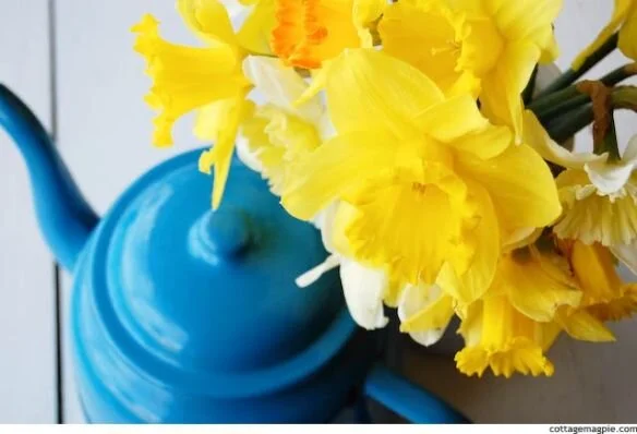
I had originally planned to just paint it white, but for some reason I couldn’t get this vintage-y bright blue out of my mind. I went through my Sherwin-Williams fan deck several times until I found a color that was similar to what I was seeing in my mind. I didn’t realize until just yesterday that the paint color was inspired by this vintage teapot that a friend gave me. Funny how things stick in your subconscious, isn’t it?
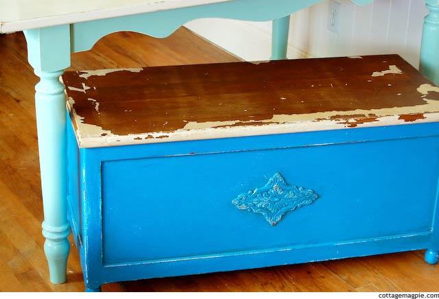
I painted the base Sherwin Williams Blue Mosque (SW 6789) and the top Sherwin Williams Softer Tan (SW 6141). I always use the sample paints for doing furniture because they have such a great chalky texture that sticks to everything. And no, I didn’t prime.
Here’s what it looked like after the first coat:
After I did the painting, I started to distress and started to think it would be neat to really strip most of the paint off the top and really make it rustic. I left just a little paint and stained over it with some water-based stain I had on hand to really dirty it up. This is what it looked like when I was done:
Here’s another before and after:
I’m actually kind of surprised that I went for such a rustic look. I am usually all about the bright, happy, retro, vintage, shabby, fairytale look. But this is what seemed to be the right thing at the time, so I went for it:
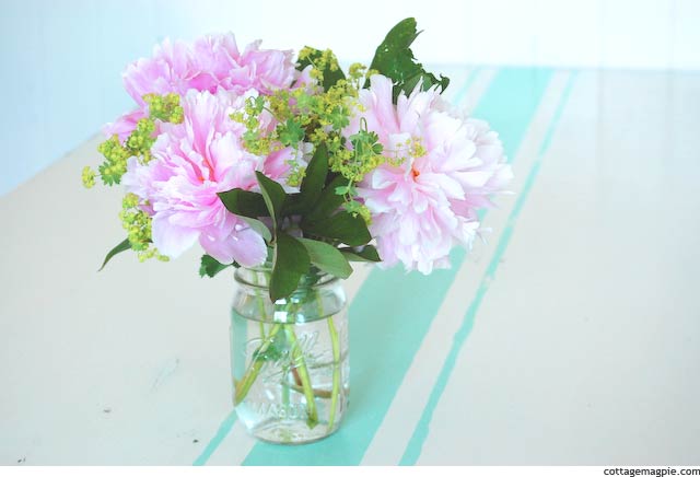
I love the vintage-y blue, and how it complements the green on my grain-sack work table. I’m not at all sure about the top. I’ll live with for awhile and see how I feel about it as the rest of the room comes together, but for now I’m happy that at least it doesn’t look sad and neglected.
What about you? Any bold colors or rustic textures making their way into your home lately?





Leave a Reply